 Image: Apple
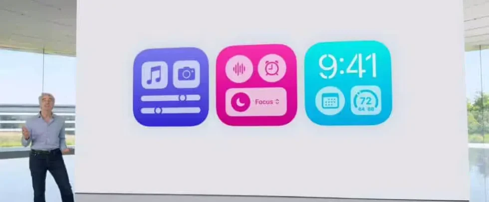
Among Steve Jobs’ many philosophies at Apple was giving customers what they need, not necessarily what they want. He famously said, “People don’t know what they want until you show it to them. That’s why I never rely on market research. Our task is to read things that are not yet on the page.” At WWDC this week, Apple gave us a ton of features that were already on the page. Several chapters back, in fact. One of the main features of iOS 18 is a whole new level of customization that permeates the entire interface, from the Home Screen layout to the Lock Screen, icons, and the Control Center. It doesn’t even have a fancy name, it just falls under the umbrella of Customization.
On the surface, it’s all good. Apple users have been clamoring for Android-like customization for years and Apple absolutely delivered it in iOS 18:
- Put icons anywhere you want on your Home Screen
- Tint apps with a dark look and adjust the color
- Hide the names of apps under icons
- Adjust the size of apps and widgets
- Add buttons to the Control Center
- Rearrange and resize Control Center icons and sliders
- Swap out Lock Screen controls
All of these have been on wish lists for years, and for the first time ever, your iPhone is as endlessly customizable as an Android phone, maybe even more so. Out of the box, you can customize the look of your iPhone’s Home Screens in a wide variety of ways—but after seeing what some early beta adopters have made, maybe it’s not such a good idea to give users so many choices.
Of course, as with all options, you can ignore whatever you don’t want; but so many options create unnecessary visual chaos and confusion. Where Control Center used to be a controlled list of buttons and sliders, it’s now several pages of options with a somewhat unclear hierarchy. We’ve been asking for this level of customization on our iPhones for years, but now that we have it, it feels cheap, convoluted, and a little un-Apple-like. It goes back to Steve’s mantra: what you think you want isn’t always what you want. The features that generated the most buzz—iPhone Mirroring, Safari Highlights, Math Notes—aren’t things we knew we wanted, but will likely become part of our workflow. That’s Apple at its best. This other stuff that lets users change the color of icons? Not so much. But that’s how it is these days. Now, Apple tries its best to strike a balance between what users want and what they need, while still delivering delightful and revolutionary features. Tim Cook has delivered some incredible products and continues to carve out new and exciting paths for Apple, most notably with Apple Intelligence, another feature of iOS 18. It’s impossible to imagine what Apple would look like under Steve Jobs in 2024. I’d like to think he’d be on board with Apple Intelligence, Vision Pro, even the many Apple Pencils. But one thing I know for sure—he’d never let us tint our icons.
Author: Michael Simon, Executive Editor

Michael Simon has been covering Apple since the iPod was the iWalk. His obsession with technology goes back to his first PCthe IBM Thinkpad with the lift-up keyboard for swapping out the drive. He's still waiting for that to come back in style tbh.


